
An Ode To Avocado
By Sarah Foote
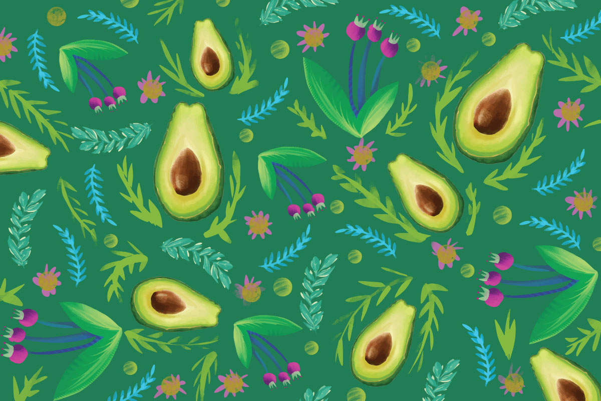
Call me a bad millennial, but I much prefer avocado in my color palettes instead of on my toast. Maybe this comes from growing up around my grandmother’s incredibly gaudy avocado green bathroom (complete with matching tub and ceramic frogs) or spending hours playing on her remarkably durable (albeit itchy) wall-to-wall wool shag carpeting. As an adult setting up my own home now, I’m pleasantly surprised by the amount of color I’ve seen making a resurgence in the aisles of Target and throughout the vacuous pages of Wayfair.
So why the comeback of olive’s delightfully acidic cousin? According to the Designer’s Dictionary of Color, avocado originally came into vogue in the 1970s with the rise of anti-consumerism in response to the 1950s and 60s age of affluence. It was meant to evoke feelings of wholesomeness and nature. I.e., if a station wagon is avocado green, it must be good for the Earth, right? More broadly, the color represents new beginnings and feels restful to the eye, as the eye’s lens focuses green light precisely on the retina.
The historical and psychological connotations make a lot of sense coming out of a time when we’re hyper-focused on cleanliness, are stressed, and have a growing concern for the state of our environment. On a frothier note, you have to love a color that can pack a distinctive punch while being versatile enough to amp up or cool down any palette. That’s the kind of color you can use to build a brand or a bedroom. So, while I’m writing this from my grandmother’s chair in an avocado and dusty rose bedroom (I’m a designer, trust me, it works), I suggest you consider injecting some old-school funk into your palettes for a feel both familiar and fresh.